|
BMW Method Conference 2005
|
|
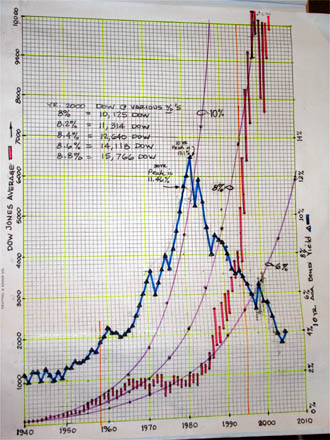
Jim: This was my original DOW chart that was hand drawn in 1994. The Blue line is the 10-year Treasury bond yield superimposed over the DOW 30. The chart clearly shows how the market reacted negatively to the high Treasury bond yield starting in the early 1960s.